7 June 2016

update and making of #26daysoffoodtype

Hey guys!
In case you didn't notice, I was in silence on the blog for the past weeks... well, over a month I'd say.
Towards the end of the #26daysoffoodtype project I got really tired and though I had plans of sharing more about it I just couldn't.
Right after finishing the project I took a small yet very well deserved vacation to meet and explore the wonderful Madrid.
When I got back I didn't really know what to talk about so I just ended up doing other stuff instead.
One of the goals I had set myself for may was redesigning my website. I'm very happy with how it turned out and you can check it here, I'd love to have your feedback on it.
And just before the end of the month I finally got around to edit the fottage I made while #26daysoffoodtype was happening.


I'm really liking this filming and editing thing, if you have any video ideas please drop me a line.
Also you can expect a video from my trip to Madrid, I'm committing to it right now! But at the rate I'm going I'll probably only get to it in a month or so.
I guess this is all for now, I hope you had a great month.

15 April 2016

My top 5 alphabets from #36daysoftype

Hello!
My 26 days of food type project has been going on for 17 days, which means there is only 9 more to go.
And let me let you, between pies, icecreams, nutella and guacamole, I've been eating a lot in the last days. Couldn't let it all fo to waste, right?

Anyway, the 36daysoftype still has a lot of days ahead so I'd like to share with you the top 5 alphabets I've been following. Maybe you don't know them already and end up liking them too.
As I've told you before, there is a big amount of great ideas so it was quite hard to decide my top 5.
Check them out by clicking the images.


5 April 2016

26days of type - food lettering

36daysoftype has started 1 week ago and it has been a lot of fun.
And A LOT of work let me tell you.
It you search for the #36daysoftype hashtag on instagram you'll find a lot of great examples of how creative we can be having the same theme.
Keep up with my project here: instagram


I've been receiving a lot of feedback which has been great! I even got featured by type.gang!


28 March 2016

26daysoffoodtype - the beginning

36daysoftype starts tomorrow!
Here's a sneak peak video of what you can expect from me (sorry if the image seems a bit wonky sometimes, I'm still figuring things out):


22 March 2016

36daysoftype are you with me?


36 days of type is a project in which you're supposed to design a letter or number of the alphabet everyday for 36 days straight. It was created by Nina Sans, Rafa Goicoecha and Victor Bregante and they invite all Designers, Illustrators and Graphic Artists to express their particular view on letters and numbers of our alphabet.
Every year (it's the third year now) designers, illustrators and lovers of lettering in general create great and inspiring pieces of design and share them mainly via instagram with the #36daysoftype hashtag. I participated in the first edition (remember this? Or this?) but skipped the second as I was taking an illustration course in London during that time.
However, I decided to get back on that train this year and I'm trying to get as many people on board with me as I can as it can be an extra motivation.
I'm only going to do the letters so it's going to be 26 days of type for me.
It starts in a week.
What do you say? Are you with me?
If you want to know more abou the project head over to their site.


16 March 2016

Flat lay photography - my new header


I don't know if you've noticed but I've been making some changes to the layout of the blog. One of the things that were bothering me the most was the header image. It's the first thing you see when you enter a blog, kind of the first impression the reader gets and mine wasn't making me happy at all!
With that in mind, I had this idea of making a new lettering piece (every excuse is a good one). The process of creating it is something I'll probably talk about in a different post as it's something I don't usually do as everything was made manually and I usually jump to the computer stage as soon as I can...
Nonetheless today I wanted to talk about the process of creating the image per se.

Idea
I knew I wanted to take a photo on my desk with a composition of elements that were simultaneously inspiring and useful. Well...not all elements are actually useful but they tell a bit more about me when you first enter the blog (that's why there's a children's book there which wouldn't usually be on my desk while I'm working on lettering but is such an important part of me that there was no way it wasn't going to be featured there. Choosing only one was obviously the problem...

Research
The objects that were going to appear in the image were decided but having google and pinterest as my best friends I decided it wouldn't hurt to see what others have been doing around the same subject. To my surprise, I discovered a world of articles about flat objects photography but they featured mainly beauty stuff

Composition
After laying the objects in an organized chaos, I started to take pictures. I suggest you take an experimental photo to get your composition right. Seeing your composition through the screen is completely different and helps you see if everything is well balanced.
An important tip is when you take some photos you think you're happy with, see them on the computer. 


For example, this is the first photo I took and I thought it was ok but when I saw on the computer I realized there was a stop of white space. With everything still in place, I was able to fix it. And I'm not even joking this was what editing looked like. Not comfortable but effective.


Light
I knew I was going to use natural light so I waited for the weekend to work on this as I come home after dark during week days.
My office is a great natural light during the afternoon but it starts to get direct sunlight around 4 pm and since I didn't want huge light contrasts I started photographing right after lunch.

Then It was just a matter of editing the image to soften the shadows and make the letting pop a bit more.
I quite like the final result and it is the first thing you see.
What do you think?


9 March 2016

my second book


I just realised I didn't post about my second book here and that had to change so here I am today, better late than never, right?
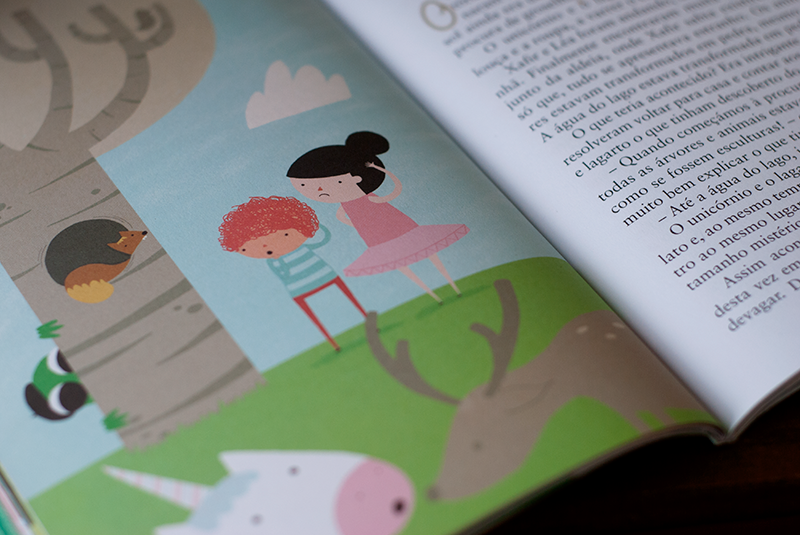
Xafir e a Feiticeira do Pântano which in english goes something like Xafir and the Swamp's Wizard is a book about a special boy - Xafir - and his friends and their adventure when they try to understand what happened in the forest where everything has turned into stone.
The book is for kids who are a little older than my first book (7-12 I'd say) so the illustrations are smaller.
I really liked illustrating this book, it was the first time I used my cintiq and worked only in photoshop instead of illustrator which used to be my favourite tool. I even think my style is a bit different but you tell me.


One other thing that's quite fun about this book is that the authors have been going to schools to present the book and I've seen some drawings kids have made about their favourite parts of the story.
Here are some of them: